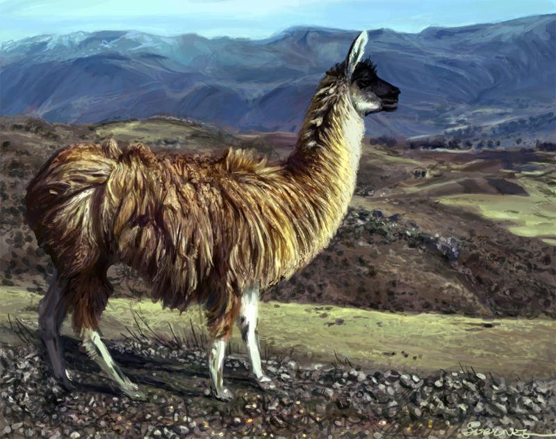
Alright, the good news first! I won the llama challenge! With a ton of
votes! Thank you everyone! I didn't really think I'd win a challenge
here in any near future so that was a surprise alright! :D
So, for today, I don't have much to show you, BUT I have learned a lesson today!
Okay, here goes. I had an image in my head for the current 2D jam
challenge (Hellhounds) but then I started to think about some stuff I've
been trying to learn recently, like focal points. So I made this image,
asking what looked best when it came to focal points:
Now, my initial idea was the top one, but I manage to confuse myself in
the focal points thing, and when I thought about them, I did the second
one. Just from looking at them, the second one seems better, does it
not?
Then somebody "harassed" (said in the nicest possible way) me into
making thumbnails. It has to be said that thumbnails and me hasn't come
along too nicely. I have a tendency to over work them, because I want
them to show that I am at least partially able to draw, you know? And
also, I tend to either make a mash out of them all or just commit way
too much into one of them (usually the first one...), and go from there.
I go too early into detail, and I know it. But there's this way of
doing things that's hard to unlearn, you know?
And then I made this thumbnail. It has to be said, it's a HUGE thing for
me, as earlier I've used as much as 30 minutes to get a thumbnail
right, but this time I used about 30 secs on each.
And I got feedback right away on that the flow on the first one was much
better than on the second one because of how the bodies were
placed/positioned. Even though it looked like the focal points on the
first one was better on the second.
If you have any opinions on this, I'd love it, even though they might contradict what I have already gotten on feedback! :)
And as a bonus thingy since the other images weren't that worked into,
this is what is going to be a magazine cover in Finland, I might add
some details to it yet. :)
Sorknes Art
"The fact that no one understands you doesn't make you an artist" Sketches, art in progress, finished art and thoughts about it all.
Pages
Saturday, 29 September 2012
Thursday, 13 September 2012
Llama photo study for Anatomicae - Finished
I never had the time to do the twist I was hoping for, but I did manage to put together the photo study - and I am pretty pleased with it. The main goal for the Anatomicae challenge over at CGHUB this time was the fur, and I've never done fur like that. :)
Sunday, 9 September 2012
More Llama!
Further progress on the Anatomicae piece.
I am hoping to get the time to make a twist to this so it's just not being a photo study, but we'll see if I have time. :)
At the moment you can clearly see that I have focused more on certain parts... like, you know.. the sweet behind... Haha!
I am hoping to get the time to make a twist to this so it's just not being a photo study, but we'll see if I have time. :)
At the moment you can clearly see that I have focused more on certain parts... like, you know.. the sweet behind... Haha!
Friday, 7 September 2012
Tree of Life, Magazine cover and Llamas....
Yeah, a bit of this and a bit of that today...
First off, joined the CGHUB 2D Drawing Jam that's currently in poll, the Tree of Life. Not one to draw a lot of trees, it was a nice challenge. I was a bit of a loss on what to do for it first, and just went with the flow - starting with the colours first, thinking about how my mother in law (Bronwynn) loves the autumn colours on trees. Came out nice, doing well in the poll. :)
Next up is what is going to become a magazine cover. This was one of the ideas that was not used for the Finnish book that came out earlier this year, now it's going on a Finnish magazine instead. Needs some more work, and I'd be happy to get input on it.
And also, here is a llama. I like llamas. It's CGHUB Anatomicae that has one going on llamas right now. So far it's basically a photostudy (which is allowed), started to play with ideas on how to make it a bit more interesting, but I think that might have to wait for a later post.. ;)
First off, joined the CGHUB 2D Drawing Jam that's currently in poll, the Tree of Life. Not one to draw a lot of trees, it was a nice challenge. I was a bit of a loss on what to do for it first, and just went with the flow - starting with the colours first, thinking about how my mother in law (Bronwynn) loves the autumn colours on trees. Came out nice, doing well in the poll. :)
Next up is what is going to become a magazine cover. This was one of the ideas that was not used for the Finnish book that came out earlier this year, now it's going on a Finnish magazine instead. Needs some more work, and I'd be happy to get input on it.
And also, here is a llama. I like llamas. It's CGHUB Anatomicae that has one going on llamas right now. So far it's basically a photostudy (which is allowed), started to play with ideas on how to make it a bit more interesting, but I think that might have to wait for a later post.. ;)
Click on images to make them bigger, if you want to take a closer looks. :)
Tuesday, 28 August 2012
Photostudy - Rain; How to deal with drawing my kid
This might be a lot to read compared to my earlier posts, but I kind of want to get this off my chest, and if I am lucky it might help others. Don't worry, there's an image at the end - you can skip the text if you want. ;)
Alright, first of all. I have a kid, she's currently three, and her name is Rain. From she was born, I have been trying to draw her, make studies and sketches - both because I wanted to capture the moments as well as getting better at drawing. I ran into a problem. I couldn't do it. First I just thought it was the hormones running utterly wild, as I would end up just staring at her with tears in my eyes being extremely happy and feeling all LOVE. As you might know, it's kind of hard to draw when your eyes are misty.
Then, as she got older, I would still get that silly "oh my goodness, is that perfect little person there actually my child", "I am the happiest person in the world" and "did I help her getting into this world?" moments whenever I sat down to study her- but I ran into another problem as well. I see her every day, I love her, I spend a lot of my time looking into her face and watching her run around... And I could NOT get sketches that I felt represented how she looks, how her face acts - in other words, I would not recognize her in my sketches, and I ended up being utterly disgusted by my tries.
When using other family members as reference I've never ran into this problem, usually because I haven't been trying to make portraits of them but rather used them as base for some kind of character in my mind. Which means whatever changes in the faces happen is just good, interesting and happy accidents. Actually, I am most of the time even TRYING to change features in their faces using several references to make up new persons.
So. When I started this picture, my main goal in this was to get down light and colours.. Then I decided to up the ante and do one of Rain, tackling two things at once. I had to tell myself several times, that this one I could use as much time on as I wanted - also, I could focus on main goal, trying to push the fact that it is my daughter a little back.
After a few tries on the face, I was starting to get utter disgusted with my incapability of rendering her likeness again, and I made a decision to paint over some rough lines of her face from the photo and then go from there. And suddenly I could go forward. Some of you might this was cheating, but to be honestly, I could not care less. I am my own client on this image, I have not put any restraints on my freelance me, and in the end the important here was that I learned something about colour and light. And I did.
There was some great surprises during this one, like how dark colours her face actually had to have to make it right. And how light colours I needed to get the proper "edge" between the shadow and light areas. And I learned tons from it. And the most important part, this is the first picture I have done where I'm trying to portrait my kid and actually showing it to anyone. If a two minute rough paintover managed to help me do that, it was worth it, when I think about how many hours I've actually used on this one. (Yes, I am still very slow, and I know it.)
I hope you enjoy the picture, because I am very proud of it. Not only because I managed to nail some colours and light that was hard for me and that I managed to paint my kid, but also because I am showing off my little Rain. I think she is adorable. :) I might try to fix more on it later, but for now it is finished. :)
Alright, first of all. I have a kid, she's currently three, and her name is Rain. From she was born, I have been trying to draw her, make studies and sketches - both because I wanted to capture the moments as well as getting better at drawing. I ran into a problem. I couldn't do it. First I just thought it was the hormones running utterly wild, as I would end up just staring at her with tears in my eyes being extremely happy and feeling all LOVE. As you might know, it's kind of hard to draw when your eyes are misty.
Then, as she got older, I would still get that silly "oh my goodness, is that perfect little person there actually my child", "I am the happiest person in the world" and "did I help her getting into this world?" moments whenever I sat down to study her- but I ran into another problem as well. I see her every day, I love her, I spend a lot of my time looking into her face and watching her run around... And I could NOT get sketches that I felt represented how she looks, how her face acts - in other words, I would not recognize her in my sketches, and I ended up being utterly disgusted by my tries.
When using other family members as reference I've never ran into this problem, usually because I haven't been trying to make portraits of them but rather used them as base for some kind of character in my mind. Which means whatever changes in the faces happen is just good, interesting and happy accidents. Actually, I am most of the time even TRYING to change features in their faces using several references to make up new persons.
So. When I started this picture, my main goal in this was to get down light and colours.. Then I decided to up the ante and do one of Rain, tackling two things at once. I had to tell myself several times, that this one I could use as much time on as I wanted - also, I could focus on main goal, trying to push the fact that it is my daughter a little back.
After a few tries on the face, I was starting to get utter disgusted with my incapability of rendering her likeness again, and I made a decision to paint over some rough lines of her face from the photo and then go from there. And suddenly I could go forward. Some of you might this was cheating, but to be honestly, I could not care less. I am my own client on this image, I have not put any restraints on my freelance me, and in the end the important here was that I learned something about colour and light. And I did.
There was some great surprises during this one, like how dark colours her face actually had to have to make it right. And how light colours I needed to get the proper "edge" between the shadow and light areas. And I learned tons from it. And the most important part, this is the first picture I have done where I'm trying to portrait my kid and actually showing it to anyone. If a two minute rough paintover managed to help me do that, it was worth it, when I think about how many hours I've actually used on this one. (Yes, I am still very slow, and I know it.)
I hope you enjoy the picture, because I am very proud of it. Not only because I managed to nail some colours and light that was hard for me and that I managed to paint my kid, but also because I am showing off my little Rain. I think she is adorable. :) I might try to fix more on it later, but for now it is finished. :)
Tuesday, 7 August 2012
Maria - Singer
So, last week I went to a concert where Maria, a wonderful singer and former coworker, moved my heart - and made me awe a bit when it came to light and shadows. :)
After having some stress pouring out of from listening, I decided I wanted to try to capture some of the way that light changed everything on stage, in my own way.
And here's the result, not your usual Sorknes stuff. :)
After having some stress pouring out of from listening, I decided I wanted to try to capture some of the way that light changed everything on stage, in my own way.
And here's the result, not your usual Sorknes stuff. :)
Monday, 16 July 2012
Sentinel Shield for Anatomicae
I totally forgot posting the stuff I did for the current Anatomicae in CGHUB
challenge here, ops! Pasting in the stuff I wrote about how I got the
design idea, then just adding random images from the process... :P
Thought process: I wanted something organic. So I started with flowers and such. Didn't really work out, but I decided I like thistle as a possible thing on the coat of arms. Don't really wanna wade through a field of them. Checked them out here: http://www.fleurdelis.com/meanings.htm and it says "defiance and surliness". Workable.
Then I thought I might go to the animals kingdom instead for ideas, and the one animal I would never try to pass is rhinoceros. I have seen them in the wild, and I was totally awed by them. Checked out the same site, and it says "ferocious when aroused". Works.
So then I thought to try to use the rhino for the design instead of the coat of arms. Also thinking about vine for the coat of arms (in addition to thistle) since it says "Strong and lasting friendship; Peace and plenty; luck and strength" - it fits with the ideas in the back of my mind.
Did some random pencils, thought process: basically none. I just thought "sea" and went from there, but I knew I wanted something asymmetric since the ones I did earlier was symmetric.
Then I kept working on the rhino-thistle one.:)
Posted the final now.
Thought process: I wanted something organic. So I started with flowers and such. Didn't really work out, but I decided I like thistle as a possible thing on the coat of arms. Don't really wanna wade through a field of them. Checked them out here: http://www.fleurdelis.com/meanings.htm and it says "defiance and surliness". Workable.
Then I thought I might go to the animals kingdom instead for ideas, and the one animal I would never try to pass is rhinoceros. I have seen them in the wild, and I was totally awed by them. Checked out the same site, and it says "ferocious when aroused". Works.
So then I thought to try to use the rhino for the design instead of the coat of arms. Also thinking about vine for the coat of arms (in addition to thistle) since it says "Strong and lasting friendship; Peace and plenty; luck and strength" - it fits with the ideas in the back of my mind.
Did some random pencils, thought process: basically none. I just thought "sea" and went from there, but I knew I wanted something asymmetric since the ones I did earlier was symmetric.
Then I kept working on the rhino-thistle one.:)
Posted the final now.
Subscribe to:
Posts (Atom)